Data visualization is a critical aspect of Exploratory Data Analysis that helps Data Analysts and Scientists visualize frequency distributions, explore causal/correlated relationships between variables in the data, find patterns, and most importantly validate the quality of data.
As we aspire to provide a native experience for Data Science Users transitioning from python-based computation frameworks to a distributed cluster computational framework like Spark/PySpark, Qubole shipped autoviz widget in the new Jupyter-based notebooks.
While Autoviz makes it easy to visualize data directly from Spark’s distributed memory and provides much-needed native experience when working with Spark, there are several limitations that led us to build a new visualization framework called Qviz.
Qviz provides a responsive user experience for visualizing data directly from Spark’s distributed memory. In this blog, we detail the motivation for Qviz and also explore the new responsive UX and capabilities offered through Qviz.
Data Visualization Flow
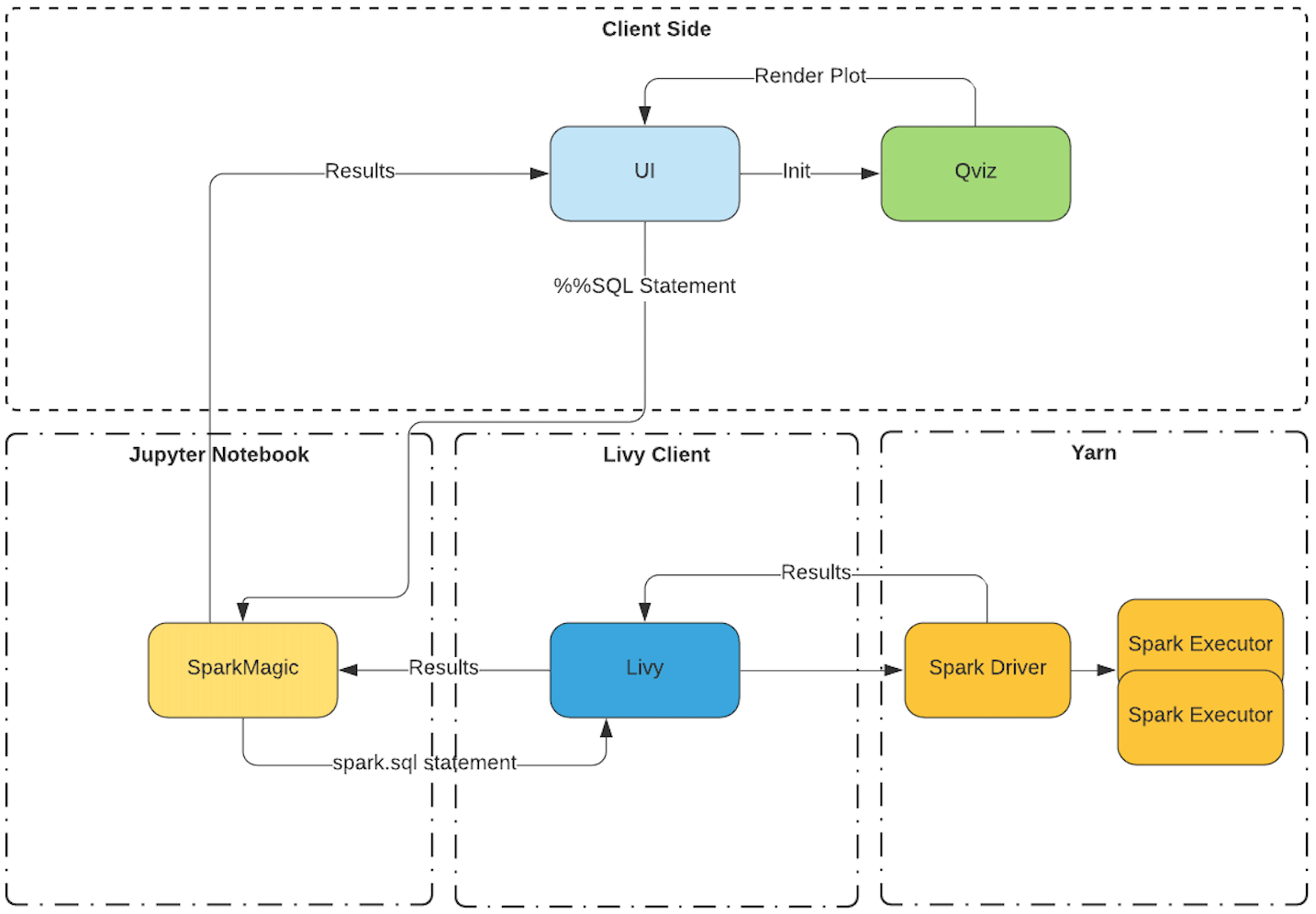
Flow without Qviz
I’ve tried to simplify how data visualization flow looks like today in our Jupyter-Based Notebooks offering with the help of this flow chart.
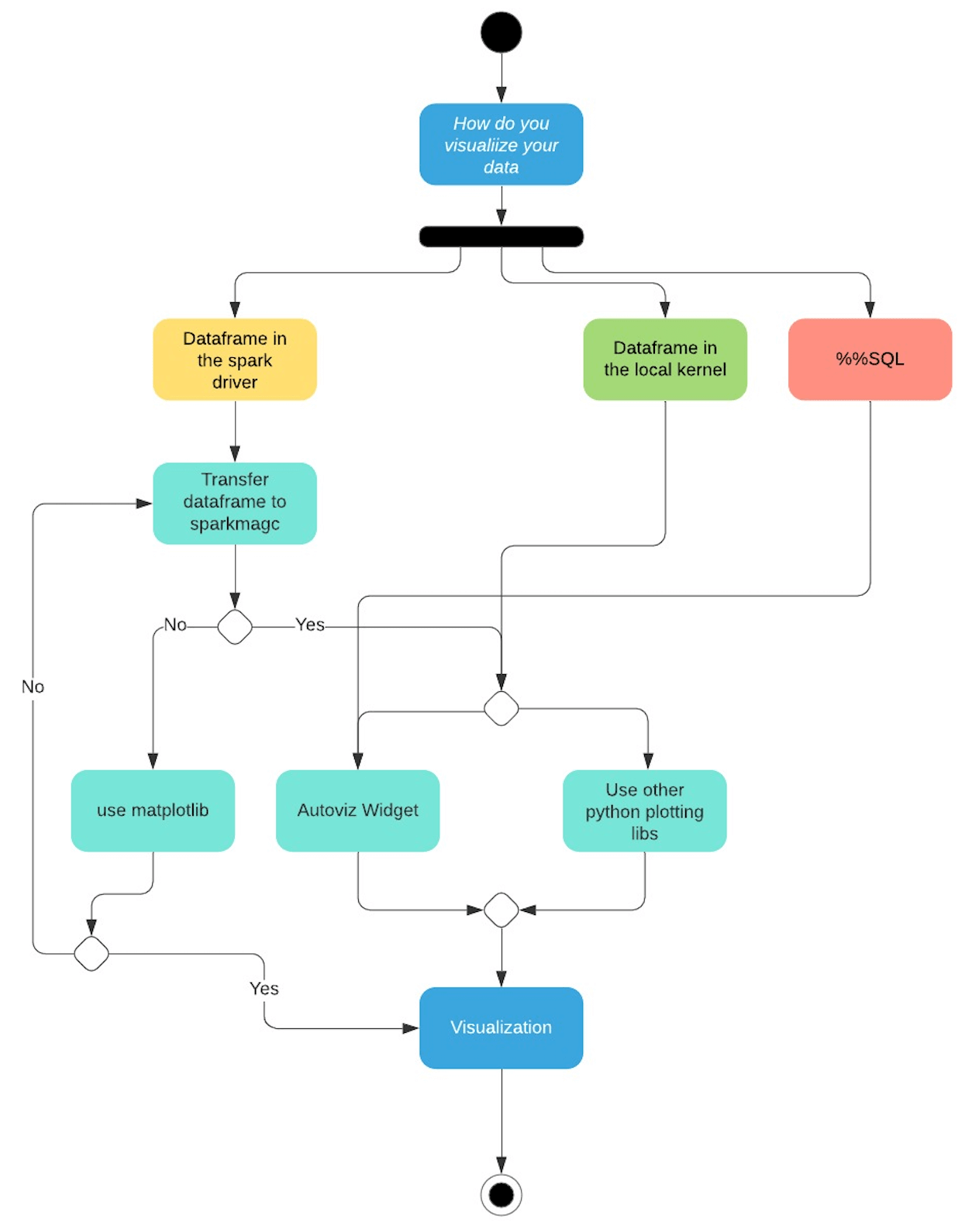
From the above data visualization flow chart we can break down the control flow based on where the data resides.
- Dataframe in the spark driver. If a user wants to interact with the data using the autoviz widget or any of the python charting libraries that can be installed using the package manager, the user has two options. Either transfer the dataframe back to the local kernel (sparkmagic) or use matplotlib on the driver.
- Dataframe in the local kernel. Here the data is already available in the local kernel. Users can either use autoviz widget to visualize it or use a python charting library of their choice.
- %%SQL magic commands can be visualized using the autoviz widget.
From the usability perspective, it’s not very convenient for the user to use different line magics to plot some data points using a python plotting library.
Users will have to write more code to plot their data based on where the code is being executed which is not a very good user experience.
Using the local kernel (sparkmagic) to render plots requires the user to transfer the data from the spark driver. This makes the local kernels more memory intensive.
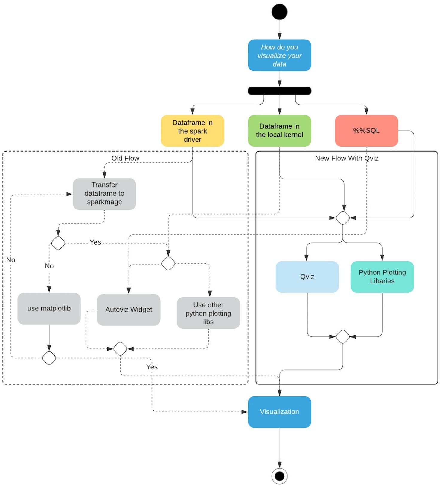
Flow With Qviz
With Qviz we have greatly simplified the experience for our users.
- You can directly visualize a dataframe that is in the spark driver using Qviz
- Dataframes on the local kernel can also be visualized using Qviz
- Furthermore, we have added support for the most common python-based charting libraries that the user can use to plot charts on the driver.
I will be talking in detail about each use case in this blog.
SQL Visualization
The current version of Jupyter-based notebooks supports a widget called autoviz that is bundled with Sparkmagic, a set of Jupyter-based tools for interactively working with Spark clusters through the Livy Rest Server.
autoviz widget is an ipywidgets-based implementation that uses Plotly to render visualizations.
When a SQL command is executed, it sends the request to sparkmagic which is then relayed to the Spark cluster via LIVY API. The results of the SQL command i.e., the processed data frame are returned to sparkmagic which is responsible for rendering the visualizations automatically using a collection of HTML widgets.
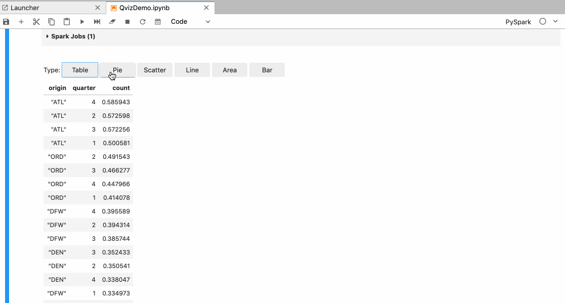
In Autoviz the user is provided with the following visualization options:
- Different types of charts like Pie, Scatter, Line, Area, and Bar.
- Different X and Y-axis.
- Aggregate the data based on max, min, sum functions, etc.
Limitations of autoviz
The kernel itself has the limitation to process one message at a time, so if the kernel is already busy then selecting different chart types or choosing new x and y-axis, etc are queued until the kernel is available again.
So in turn leads to a bad user experience. Users typically have to wait for a couple of seconds to possibly minutes depending on the data.
Other limitations are
- If the kernel is disconnected or terminated, the chart controls stop working.
- If the notebook is refreshed and the kernel is lost, the charts might not render at all.
- If the user switches to a different cluster and reopens the notebook, the charts are not re-rendered.
- Only a few chart types are available.
Replacing Autoviz
Qviz is a Jupyter frontend extension that takes in serialized data from sparkmagic and uses it to render different charts in the UI. Under the hood, Qviz uses the PlotlyJS Javascript API to get things done.
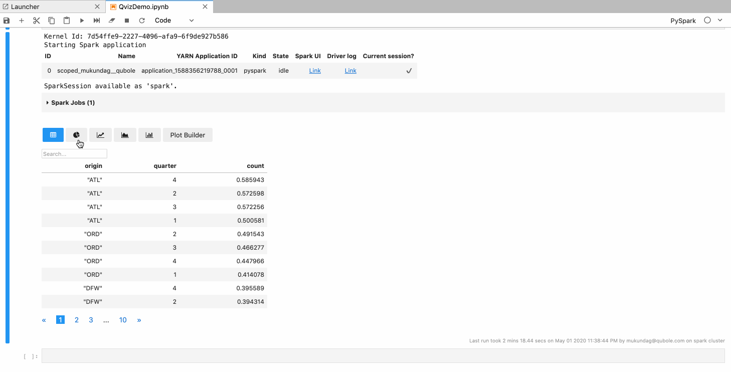
Features
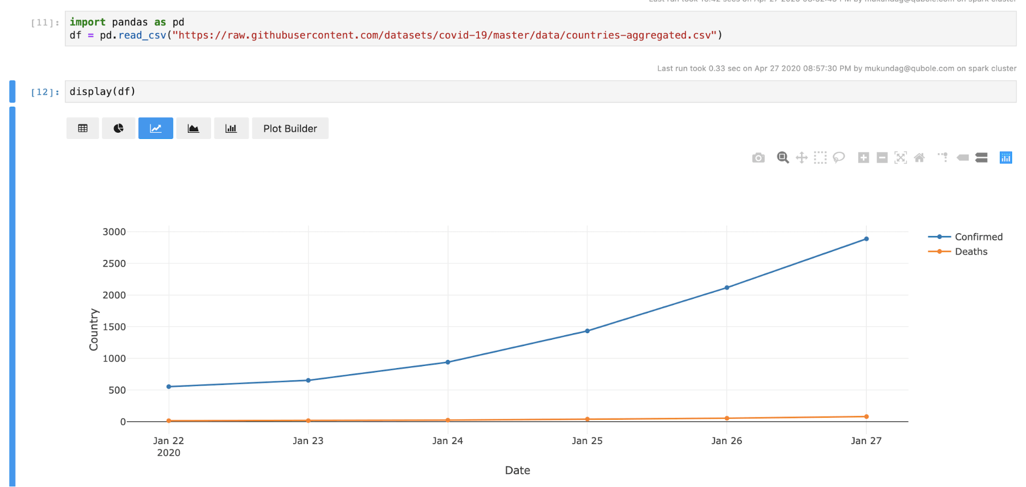
- Users can switch between different types of charts like line, area, bar, pie, scatter, etc.
- Users can choose the x and y-axis.
- Users can aggregate data functions like max, min, sum, count, etc.
- Users can plot multiple traces.
- Chart configurations like stacked bar mode, grouped bar mode, etc. are available.
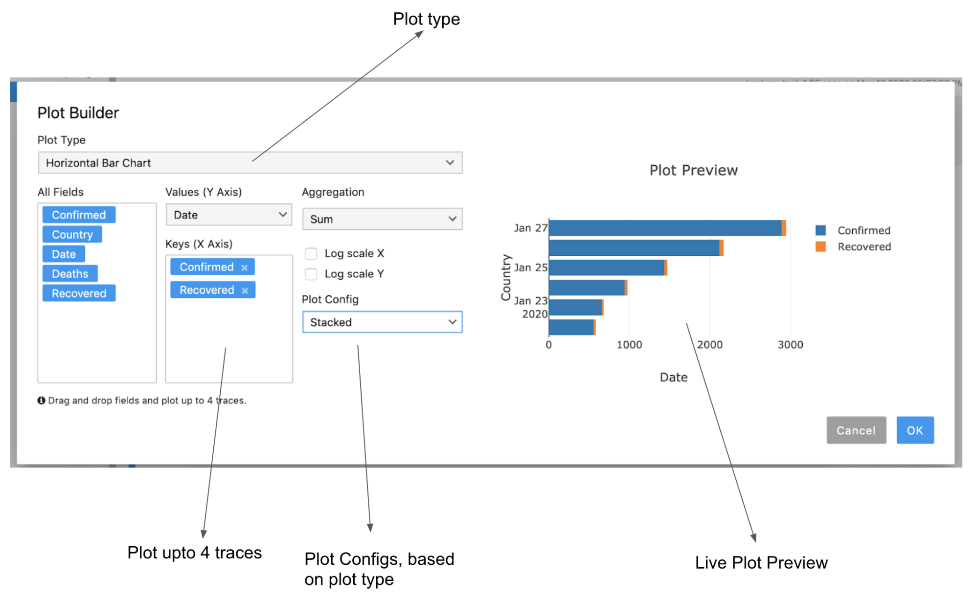
Plot Builder
We have also introduced a plot builder which would help the user build plots with ease, some of the key features of the plot builder are.
- It has a live preview of the plot you are building.
- Users can drag and drop keys to plot up to 4 traces.
- Plot configurations like stacked or grouped modes are also available for appropriate chart types.
Advantages of Qviz
- Since all the processing like selecting different chart configurations etc. will be done on the UI, the user doesn’t have to wait for the kernel to be free.
- Switching between charts is instantaneous.
- Selecting a new x and y-axis or selecting a new aggregate function is instantaneous.
- Chart configuration is persisted to the notebook cell model so when the notebook is reopened or when the kernel is disconnected, qviz will still be able to render the charts based on the previously set configurations.
Visualizing Spark and Pandas Dataframes
Current Limitations
There are a few limitations with visualizing a dataframe today in notebooks.
- Autoviz only works in the local kernel.
- You will have to transfer the data from the spark driver to the local kernel to render the dataframe using autoviz.
- If you want to use third-party charting libraries like matplot, ploty, seaborn, etc. to visualize your dataframe, you will need to transfer the dataframe to the local kernel.
Using Qviz to render dataframes
Qviz supports more than just SQL, it also supports spark and pandas dataframe.
We have introduced a display(df) method which takes spark and pandas dataframe as arguments using which you can render your data frames with Qviz.
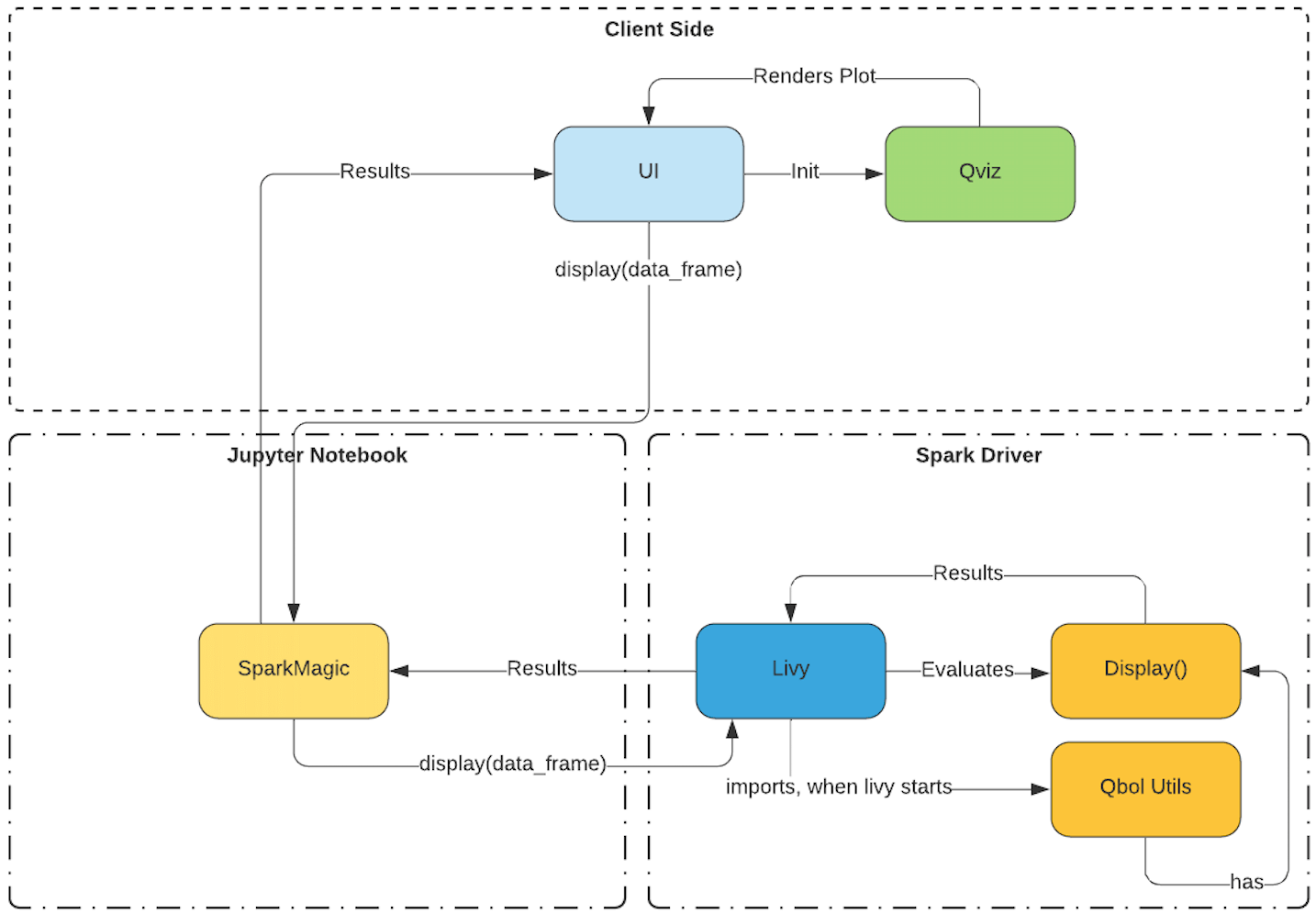
We have also introduced a utils package that is initialized when livy starts.
This utils package has this display method in it. When the display method receives a dataframe, the display method converts it into a format recognized by Qviz, and it’s sent back to the UI with a signature in the response to initialize Qviz with the data. Once Qviz receives this signature, it will initialize and render the data.
Visualizing using third-party charting libraries like matplotlib, plotly, seaborn, etc.
Transferring data from the driver to the local kernel
In Qubole Jupyter-based notebooks, you can use almost every third-party library out there that the package manager supports.
Plotting on the driver using any of these libraries is not supported. You will have to transfer the data from the spark driver to your local kernel.
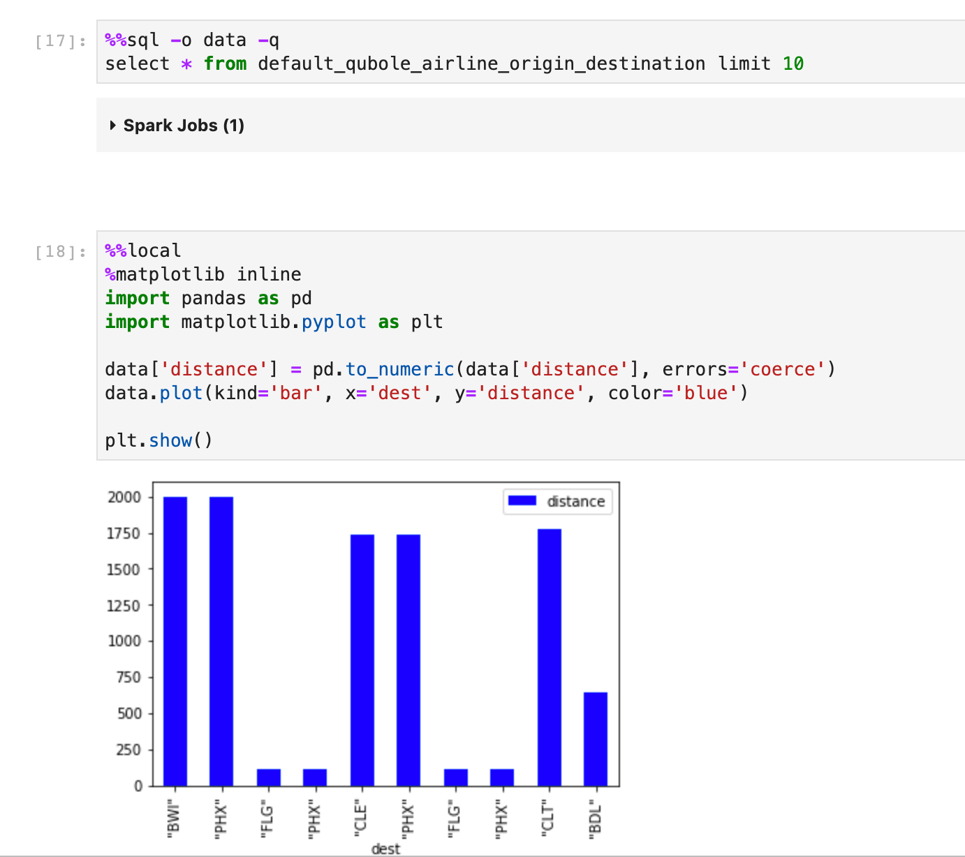
Let’s take a look at this example.
Here in the first cell, I’m executing a SQL Command and then I’m sending the data back to the local kernel using the -o flag as variable data
In the second cell, I’m using %%local magic to render a bar plot using matplotlib on the local kernel.
Using display() to plot directly on the driver
The data you are trying to plot can be huge, and bringing that data to the local kernel will tax the memory of the local kernel which is critical to keeping Jupyter Notebooks running smoothly.
In the latest release, we have shipped a display utility function that renders spark and pandas data frames, and can also be used to render plots on the driver.
Using the display() method to plot on the spark driver is not only convenient because you don’t have to transfer the data but is also very memory efficient.
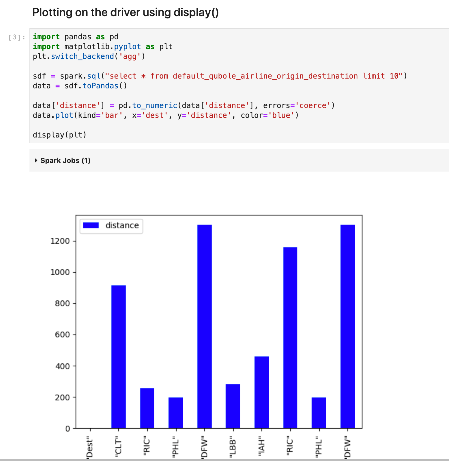
In this example, I’m using the spark.sql command which is executed on the driver and the resulting dataframe is available on the driver.
I’m building a bar plot using matplotlib
And simply calling the display method with the plot object as an argument.
And the magic happens and it renders the plot without having to transfer the data back to the local kernel to visualize it.
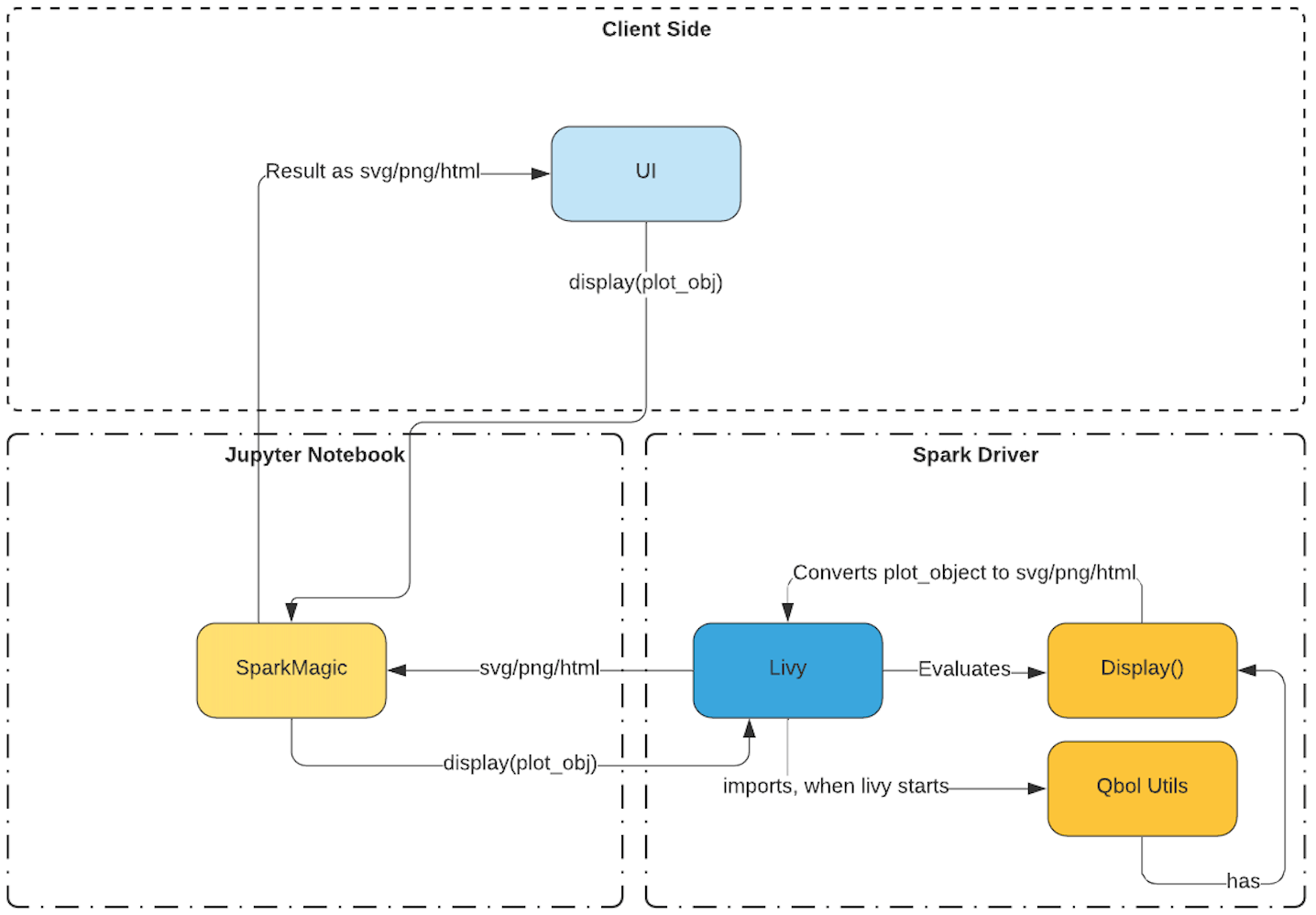
Let’s take a closer look at how the display method works with plot objects.
As I’ve previously talked about how the display method renders a dataframe, it works similar to the earlier example.
The plot object is passed as an argument to this method, the plot object is an instance of the charting library you are using.
If we go by the matplotlib example the plot object is a reference to matplotlib library, matplotlib has a method that allows the conversion of the chart to a png.
This png is converted to a base64 encoded string and sent back to the UI with mime type as png/html. Jupyterlab automatically does the rendering of this png image based on the mime type.
As of today, these are the libraries that will work with the display method: matplotlib, plotly, seaborn, altair, pygal, and leather.
Conclusion
Qviz enables data scientists and data analysts to do quick data visualization, combined with the power of distributed processing using spark with our Jupyter-based notebook offering.
Qviz helps those set of users who just want results quickly and do not want to spend much time learning about different visualization libraries. Qviz streamlines the data visualization user experience.
Try Qviz Example notebook via Free Trial to get the first-hand experience of Qviz. If you are a current Qubole customer, reach out to our support team to enable Qviz for your account.