Important stories live in our data, and data visualization is a powerful means to discover and understand these stories, and then to present them to others. Within Qubole notebooks users can leverage the built-in charting tools to create visualizations.
In addition to the built-in charting capabilities, users sometimes find the need to create custom charts. Now, QDS notebook users can leverage the newly enabled %angular interpreter to create interactive visualizations using libraries such as Plotly, and Bokeh. The graph below is an example of custom plots you can create using Plotly in QDS notebooks.
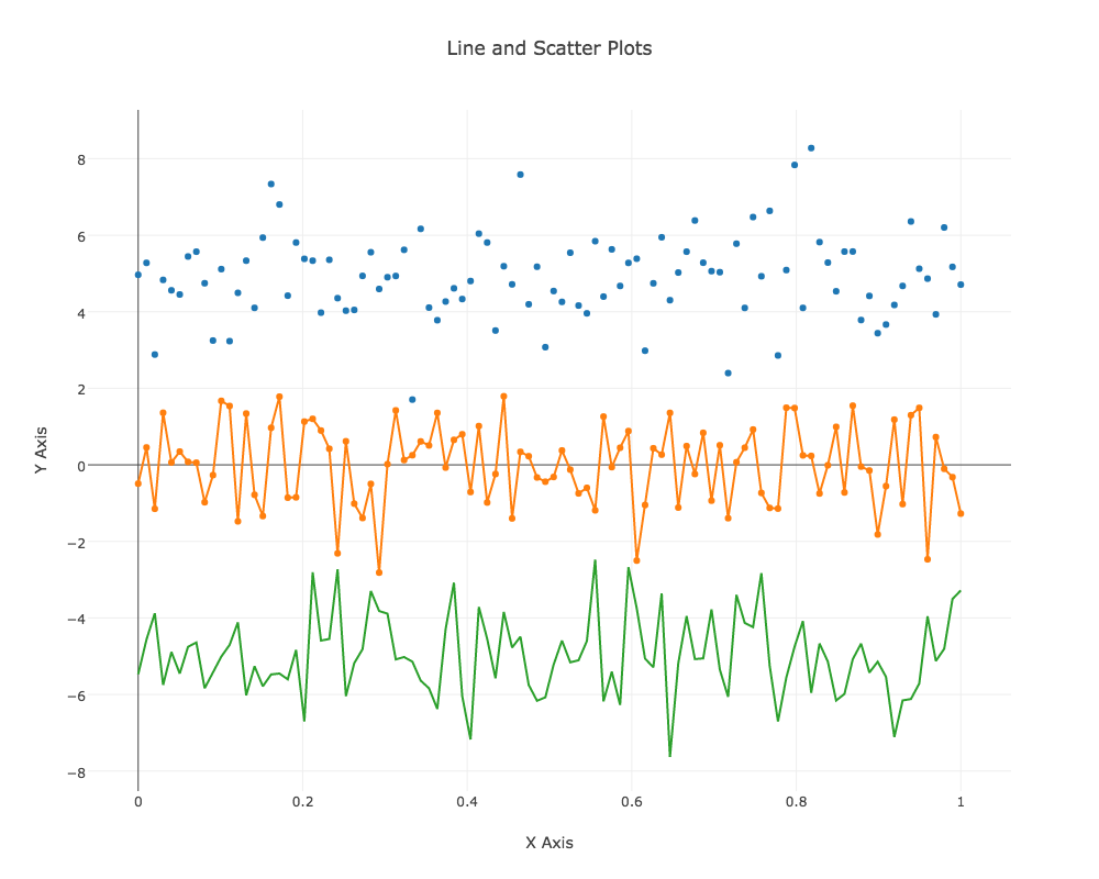
The following section will walk you through creating the above data visualization using Plotly.
Plotly
Plotly is an open source Python graphing library. Plotly.js supports 20 chart types, including 3D plots, geographic maps, and statistical charts like density plots, histograms, box plots, and contour plots. More details about Plotly, and additional charts can be found on Plotly’s home page.
Required libraries
You’ll need Python 2.7 and the following Python libraries installed to run this code:
- Plotly
- NumPy
To enable Python 2.7 within QDS please follow the Documentation. The QDS notebook provides an easy single line code to install any libraries needed. Inside the notebook you can do the following:
Step 1: Installation of Libraries
%sh
pip install plotly

pip install numpy

#Additional option is to do a pip install as part of the bootstrap.
Step 2: Import of Libraries
%pyspark
import plotly
import numpy as np
import plotly.graph_objs as go
import numpy as np
Step 3: Import of Libraries
%pyspark
def plot(plot_dic, height=1000, width=1000, **kwargs)
    kwargs['output_type'] = 'div'
    plot_str = plotly.offline.plot(plot_dic, **kwargs)


Step 4: Generate random values
%pyspark
# Create random data with numpy
N = 100
random_x = np.linspace(0, 1, N)
random_y0 = np.random.randn(N)+5
random_y1 = np.random.randn(N)
random_y2 = np.random.randn(N)-5
Step 5: Create Traces
%pyspark
trace0 = go.Scatter(
    x = random_x,
    y = random_y0,
    mode = 'markers',
    name = 'markers'
)
trace1 = go.Scatter(
    x = random_x,
    y = random_y1,
    mode = 'lines+markers',
    name = 'lines+markers'
)
trace2 = go.Scatter(
    x = random_x,
    y = random_y2,
    mode = 'lines',
    name = 'lines'
)
Step 6: Generate Plots
%pyspark
layout = dict(
        title = 'Line and Scatter Plots',
        xaxis = dict(title='X Axis'),
        yaxis = dict(title='Y Axis'),
        showlegend = False,
        height = 800
    )

data1 = [trace0, trace1, trace2]
fig1 = dict( data=data1, layout=layout )
plot(fig1,  show_link=False)